
Case study
+150% mortgage renewals

Table of contents
(Back to) Phase 0 →
Messaging evolution →
Reviews and stakeholder navigation →
Project results →
Lessons and takeaways →
Project overview
Wins
26% sign-in rate on an educational page.
+186% started mortgage renewals vs. the product page.
+150% completed mortgage renewals vs. the product page.
New processes and training artifacts for the whole UX team.
Context
The need: a bank was concerned that a large cohort of pre-pandemic mortgage buyers would panic at their renewal period due to higher, post-pandemic rates—jeopardizing long-term relationships (and revenue).
The goal: to mitigate or eliminate the shock of higher interest rates for pre-pandemic home buyers approaching their first mortgage renewal.
The plan: the marketing team would create an email drip campaign that would send customers to an educational web page created by the UX team.

Constraints
- Time frame: 2 weeks (initially)
- Format: responsive web page
- Team: 1 Content Designer, 1 Product Designer
(Back to) “Phase 0”
Reframing requirements ↓
Research to insights ↓
Reframing the requirements
Contribution level:Leader
The brief materials we received from the Marketing team left a lot to be desired. The proposed outline we received was chock full of financial lingo and unvalidated assumptions.
Marketing wanted to frame the experience according to how the bank processed mortgage renewals.
I proposed a new outline that reframed the experience to show users where, when, and how to make mortgage renewals work in their favour—one step at a time.


Distilling research into insights
Contribution level:Leader
I gathered 3 sources of existing UX research:
- Third-party industry reports
- Previous internal UX research studies
- Recent user interviews from a parallel project*
Then I uncovered these insights:
People viewed banks as untrustworthy—not advisors. Trust had to be earned.
Most users wanted to know how their mortgage payments would fit into a monthly budget.
Half of users didn’t know the difference between mortgage renewal vs. refinancing.


*These interviews covered the American market, but this project was for the Canadian market. I cautiously included the strongest consumer psychology insights from the American markets to supplement our research efforts here, making up for the lack of time and research budget.
Messaging evolution
Outline to wireframe ↓
First iteration ↓
Diverging stakeholders ↓
Outline to wireframe
Contribution level:Leader
I created an outline based on these principles, developed from research insights:
Earn trust through transparency and simplicity before pitching anything.
Positioning mortgage renewal “with the bank you know,” since about half of users buy and renew from institutions where they have existing relationships.
Disarming financial anxieties tied to rate increases, hidden housing costs, and the consequences of missed payments.
Ordering the messages and major interactive elements made tactical messaging decisions clearer and faster.

First iteration
Contribution level:Partner
Our first complete iteration followed this flow:
- Defining and demystifying mortgage renewals.
- High-level mortgage renewal tips (what users expect to read).
- Clarifying mortgage renewal from refinancing.
- Offering reasons to renew with this bank, including payment flexibility options.
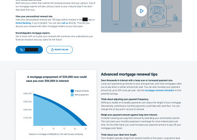
- Mortgage renewal calculator and FAQs.
I leaned on my Product Design partner as a financial subject matter expert here, since he used to work as a bank service advisor. It helped immensely to clarify product nuances and to supplement my research.


Diverging stakeholder interpretations
Contribution level:Partner
I designed the content to educate customers rather than aggressively converting them, as the brief requested. Our Product team disagreed with that approach.
We learned the Product team held a project kickoff without the UX team, which—while unsporting—led us to believe they held new information that superseded the brief.
In an effort to harmonize our efforts with the Product team, we adapted the page for a conversion-first focus.
That led our stakeholders to believe we had ignored their requirements.

Reviews and stakeholder navigation
Challenging stakeholders ↓
Managing reviews ↓
Response strategy ↓
Challenging stakeholders
Contribution level:Partner
The Marketing team was visibly upset that we had created a conversion-oriented page instead of an educational one. With no explanation for why the Product team redirected us away from the brief, the Marketing team reported the situation to their leaders.
My partner and I worked to rebuild the relationship and accommodate a high volume of feedback amid increasingly aggressive behaviour.
To that end, we created time and space for the Marketing team to articulate their viewpoints—and we discovered that they had conducted client listening calls.
We didn’t receive those reports (we asked), but we did glimpse the stress they felt about the project. We decided that our best bet was to de-escalate wherever possible in order to keep feedback sessions on track.

Managing the review cycle
Contribution level:Leader
The Marketing team increased the volume and granularity of their feedback with each round, so I responded with a simple strategy:
Accept 80% of feedback to demonstrate cooperation, delivered in 1-2 days.
Uphold major structural and messaging decisions to preserve the overall experience.
This meant:
- Truly educating on product fundamentals.
- Earning trust before saying “renew with us.”
- Keeping an approachable and informative tone.
This showed our stakeholders (and all eyes on the project) that we took their feedback seriously.


Leading a response strategy
Contribution level:Partner
Cooperation and accommodation alone did not convince the stakeholders to progress the project, so I looped in my UX leaders to advise.
Here’s how we worked through it:
I led a response strategy session with my Manager and Director.
I shared parts of my work board to show the sheer volume of feedback (which my leaders could share in back channel conversations).
I equipped my UX leaders with my research and Phase 0 work to show their peers that we had business goals in mind.
It worked. Our stakeholders eased up, letting us ship the new experience—and the results were excellent.


Project results
26% sign-in rate
for an educational page.
+186% started mortgage renewals
vs. the original mortgage product page.
+150% completed mortgage renewals
vs. the original mortgage product page.
Building the Content Design practice
"Phase 0" project guidelines
I turned my experience into a project kickoff framework for other Content Designers to independently assess project opportunities, risks, and relationships.
Stakeholder feedback model
I created a matrix for the UX team to scope feedback from every major stakeholder group, letting the team set expectations and run faster reviews—with better stakeholder relations.

Lessons and takeaways
Success came from user trust
The experience delivered on the promise to teach users how mortgage renewals worked before asking for anything. Our success demonstrated that earning trust is half the challenge.
Imperfect research still drives good results
Using patchwork research put the project much further ahead than relying on stakeholder assumptions. Even research from a different market still helped immensely, when handled with caution.
Good work doesn't defend itself
Protecting good work is its own skill. Everyone has their own biases and pressures that drive them to dismiss research and craft-based decisions. Bringing allies on-side and making stakeholders feel heard is part of the job.
View my other UX projects


View my other work by position

Content and Product Design at WestJet
I joined WestJet to expand my UX thinking in a new industry—and in a product space where mobile and web apps need to work in tandem with real-world services.

Content Design at BMO
The Bank of Montreal brought me on to help them build content design system standards, processes for their enterprise CMS, and a fresh perspective on their UX practice.

Content Design at Meta
Meta recruited me to improve the internal tools that power sales and support operations for tens of thousands of employees pushing advertising solutions every month.

Content Design at Shopify
I helped relaunch Shopify's logistics and fulfillment service alongside program managers and product marketers, simplifying logistics and delivery for growing merchants.

Creator project: Employed Historian
I started a solo project during the pandemic to show liberal arts grads how to explore and build careers. This included a 100-page website, an ebook, and (almost) a podcast.
SEO and content marketing at aha insurance
I grew the company's organic search traffic from 1K to 60K per month, and helped to create one of the most cost-effective paid search campaigns in the industry.
Want to work together? Let's chat.
Feel free to send an email if you'd like to chat.
I love talking shop over a cup of coffee—and about side projects and new ventures.