
Snapshot: Shopify Fulfillment Network website

Context
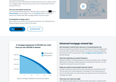
Shopify was about to relaunch its done-for-you order delivery service… and its web page was a little rough.
On top of that, the program managers and finance teams were still finalizing the product in the days leading up to the launch.
Constraints
- Time frame: 6 weeks
- Components: new and existing
- Format: web
The challenge
Creating web pages for this product-in-progress had a few speed bumps:
- Target merchants lacked familiarity with scalable logistics.
- Shopify introduced a brand-new pricing model for a logistics service.
- Few people inside the company understood the product.
Luckily, the product was actually quite good, and the pricing model had the merchant’s best interests at heart. None of the mental models or user education would have mattered otherwise.
Recreating the new pages came down to two approaches:
- User education resting on sound information architecture.
- An effective flow built around progressive disclosure.
The solution


Before and after


Check out my other projects
Click on a project to learn more about it.


Want to work together? Let's chat.
Feel free to send an email if you'd like to chat.
I love talking shop over a cup of coffee, even if you just want a second opinion on something.
Coffee's on me.